Hay

Strategy, IA, and onboarding design to accelerate the launch of Australia’s newest challenger bank.

Hay Bank ux design

The Problem.

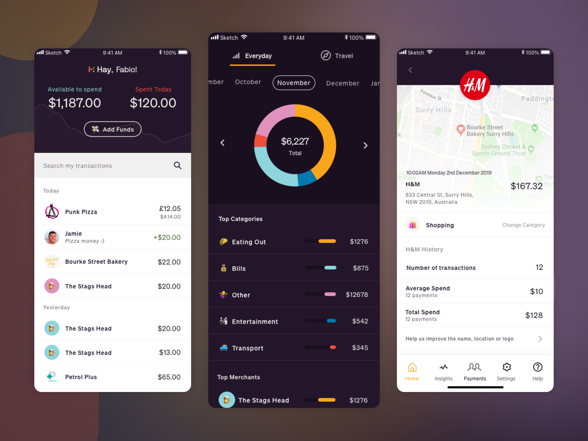
The team at Hay had the ambitious target of launching a new challenge bank in the Australian market, taking advantage of recent banking regulatory changes.

With a USP of low exchange rates for travellers, Hay wanted to quickly design a class-leading banking experience, gaining a crucial advantage over other startup banking competitors and differentiating themselves from banking incumbents.

Mapping the onboarding journey for Hay bank. User journey mapping - onboarding
First click testing with Optimal workshop First click test results

Approach.

Working closely with the head of marketing and market research, and the product strategy lead, I created the user experience strategy, information architecture, user journeys and onboarding process design.

A collection of Australian market and discovery research including interviews, surveys and focus groups, informed design decisions alongside continual stakeholder feedback and alignment.

Unmoderated testing was vitally important, using tools such as Optimal workshop to conduct tree tests on the IA and first clicking test on low-fidelity wireframes to test content strategy, while also capturing qualitative feedback from participants.

Hay bank content and IA wireframes Low fidelity wireframes, focusing on content and navigation structure

An extensive onboarding journey map was created, including numerous edge cases around account verification and KYC, with a focus on providing continual feedback to users and adding as much delight as possible to create a positive and memorable first-time user experience.

I designed low-fidelity mocks for the core app navigation outlining the content strategy for each view, alongside a low-fidelity but a detailed prototype of the onboarding process.

Working alongside in-house designers I then created several UI design explorations before the creation of a style guide enabled me to focus on high-fidelity UI design for the FTUX and onboarding experience.

Hay bank UI design concepts and explorations for onboarding Onboarding flow

Outcomes.

Hay launched in the Australian market in early 2020 and received widespread acclaim and positive reviews.

“This is how onboarding should be done. Neobank Hay takes design empathy to its logical extreme, celebrating every successfully completed stage in the signup process. The journey is near-effortless, with a progress bar to keep motivation high. Not to mention colourful, clean and clear. When onboarding can be this vibrant, dropout rates can definitely be lower.”

💬 Review by Gus Mallett, 11:FS
Hay bank UI design concepts and explorations UI concepts & explorations

🤝 Interested in working together?

Get in touch hello@russellkerr.co.uk

Close Menu
Work About Get in touch